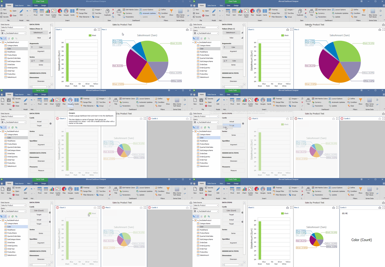
Dashboard
Dashboard Designer allows users to perform functions such as titling, editing color palettes, currency, design options, automatic updates, and refresh. With these features, users can precisely tailor their reports to their needs

Title
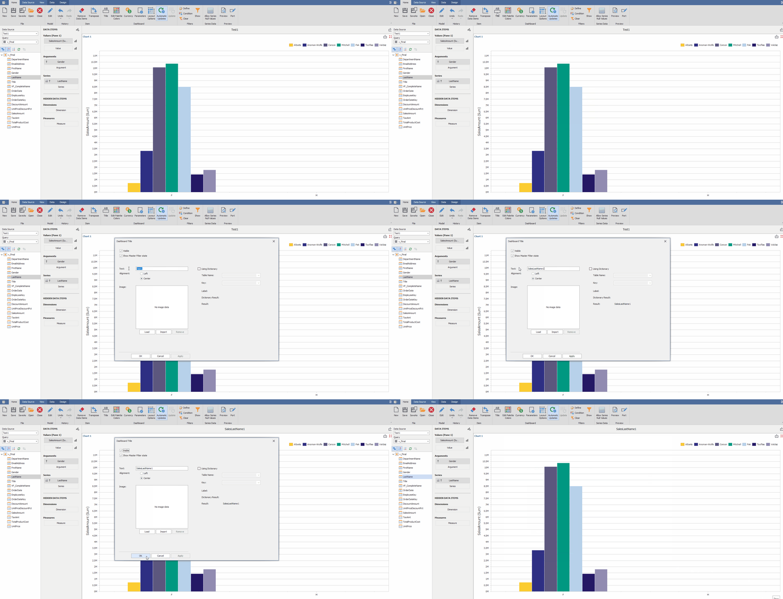
This feature allows the user to assign a custom title to each report, which goes beyond a simple identification. Custom headings become mini-headers that guide the interpretation of the data. By allowing users to express the desired narrative, a deeper and more contextualized understanding of the findings is encouraged.
How to Rename the Report:
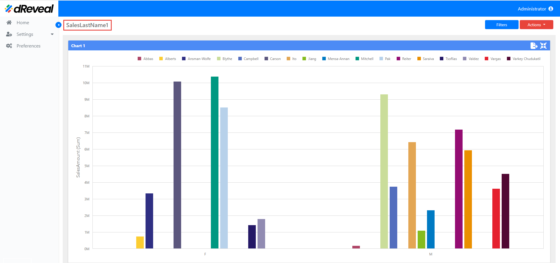
To rename a report, start Dashboard Designer and navigate to the report. Locate the icon corresponding to the title edition and proceed to enter the new name. Once you have made the necessary adjustments, save your changes and upload the report to the web server for viewing under the new name.
Dashboard Designer
Expected Output
Edit Palette Colors
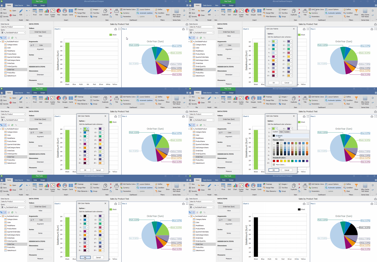
This feature allows users to tailor graphics and visualizations to their unique visual style. By editing the color palette, they can select hues that reflect their brand identity, creating consistent and professional reports. Additionally, they can customize color schemes for individual graphs, ensuring that the most important information stands out and is easily identifiable
How to Edit Palette Colors:
To customize the colors of your graphs and give them a unique touch, open the Dashboard Designer and select the report you want to modify. Click on the 'Edit color palette' icon and choose the new colors that best suit your needs. Once you have selected the desired shades, click 'Accept' to confirm the changes.
Currency
This feature allows users to display numerical values in their preferred currency format. Whether it's the local currency or a foreign currency, users can customize the currency symbol to adapt to different regions and accounting standards.
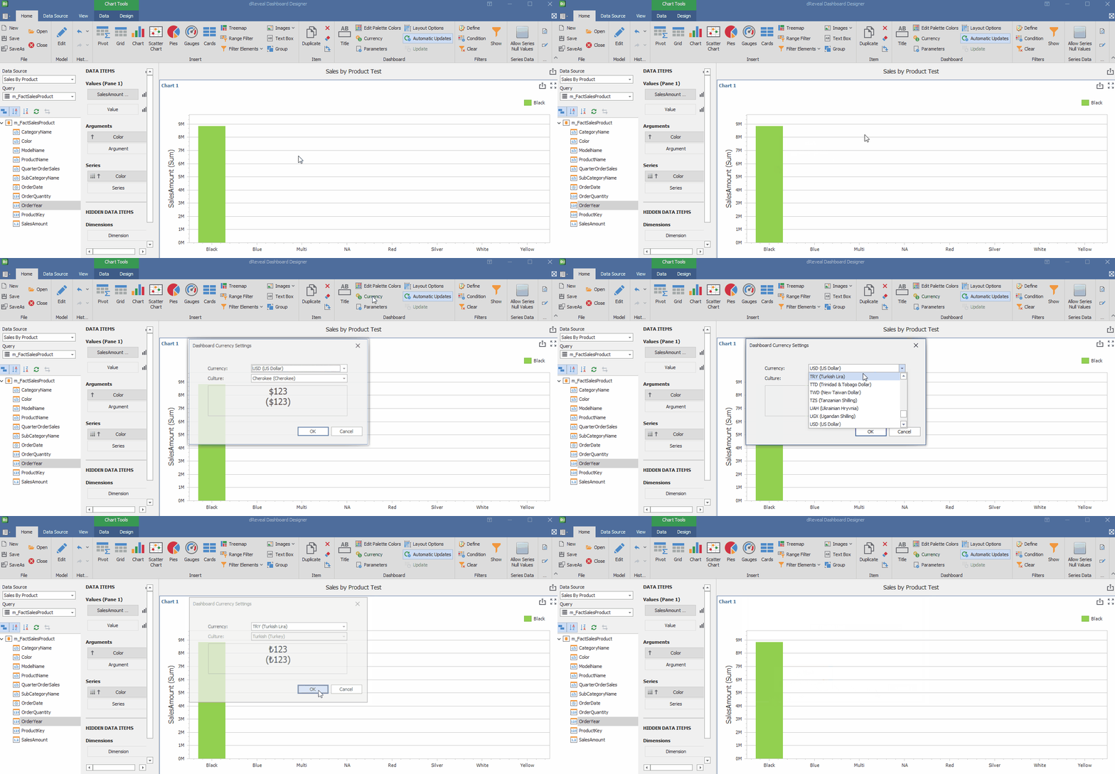
How to select a Currency in the Dashboard:
To view your data in the desired currency format, open the Dashboard Designer and select the report you want to modify. Then, find and click on the 'Currency' icon. In this section, you can choose the currency you prefer to use. Once selected, confirm the changes by clicking 'Accept'. In this way, all numerical values will be displayed with the corresponding currency symbol and in the appropriate format.
Layout Options
Layout options provide users with a wide range of possibilities to customize the appearance and placement of graphs within a report or dashboard. From adjusting size and shape to choosing different visualization types, this feature allows you to create graphs that are not only informative but also visually appealing and tailored to each user's specific needs.
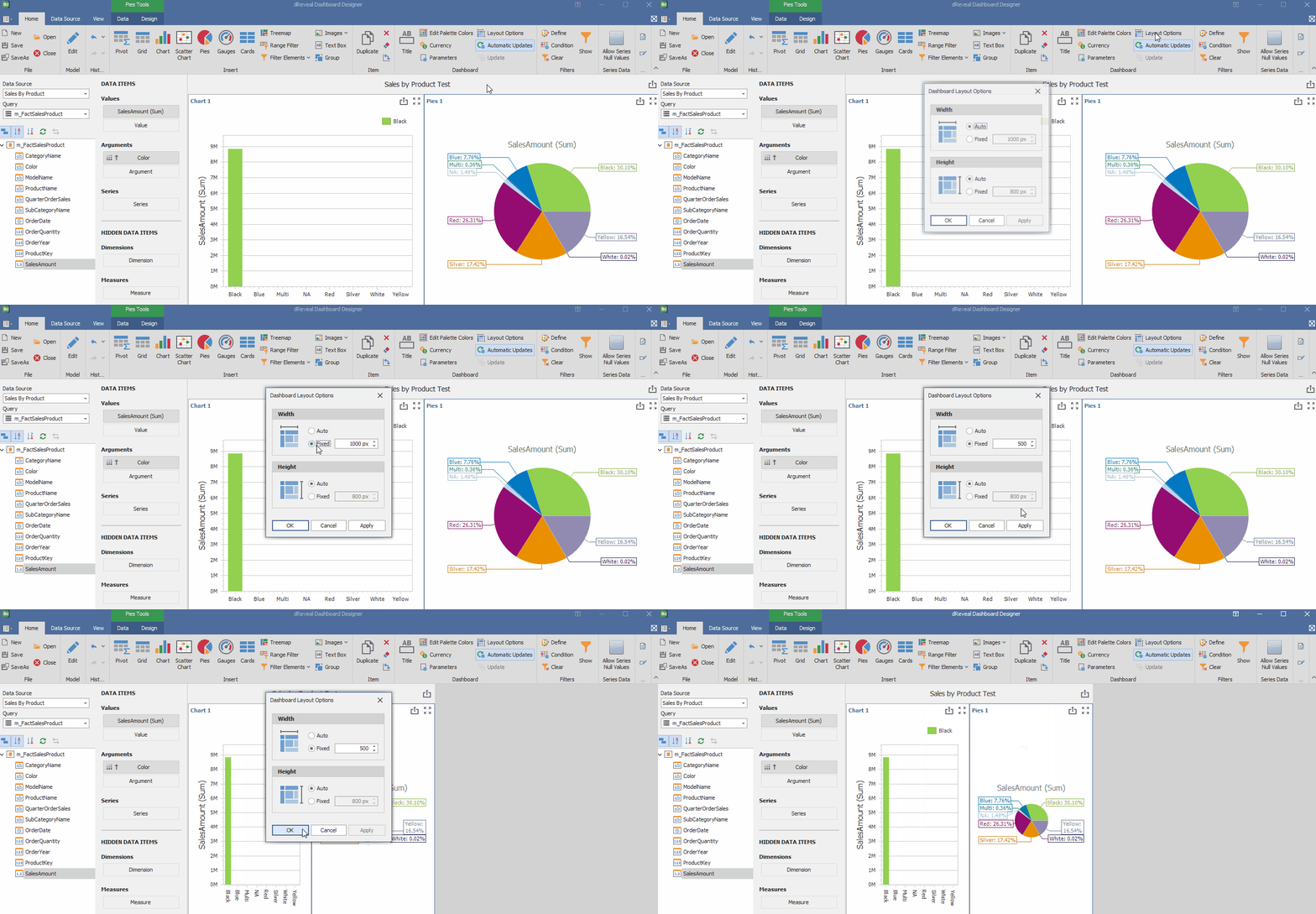
How to Change the Layout Options:
To customize the width of a graph, open the Dashboard Designer and the report you want to modify. Then, click on the "Design options" icon. In the configuration options, select the "Fixed" option for the graph width and adjust the desired size. Once the change is made, confirm by clicking "Apply" and then "OK". In this way, you can adapt the size of the graph to your specific needs and improve the visualization of your data.
Automatic Updates
They save users time and effort by eliminating the need to manually update data every time a change is made. This feature ensures that reports always display the most recent information, facilitating decision-making based on accurate and up-to-date data.
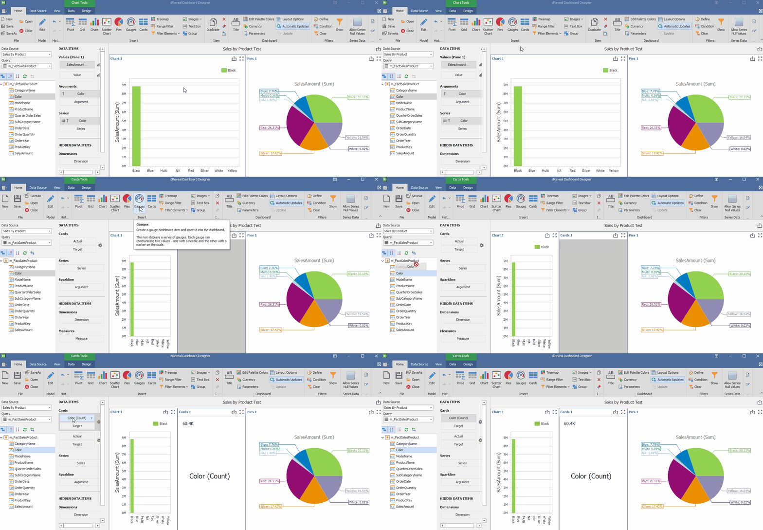
How to Automatic Update in the Dashboard:
Access the Dashboard Designer and start a new report or select an existing one. To ensure your report data is always up-to-date, enable the "Auto-refresh" option. This setting will automatically refresh your graphs and data. Once enabled, you can add new graphs to the report, and they will update in real time as new data is added to your data source.
Update
It is a manual function that allows users to refresh the report's data and graphs on demand. Unlike automatic updates, which run in the background, the 'Refresh' option requires explicit user action. This feature is useful when precise data is needed at a specific time or when automatic updates are disabled.
How to Update in the Dashboard:
To manually refresh a dashboard, first go to the Dashboard Designer and create a new report or open an existing one. Make sure to uncheck the "Auto-refresh" option to perform a manual refresh. Once you've added the desired graphs, click the "Refresh" icon. This will update your report's data and display the latest information in the graphs.
